Proteam
- Lex1s20

- Aug 29
- 1 min read
Updated: Aug 31
Proteam is a high-performance brand built for champions. Its identity reflects precision, strength, and the relentless pursuit of victory. In creating this branding, we aimed to merge the technical excellence of professional ski and biathlon equipment with a bold, distinctive personality that speaks to athletes who push beyond limits.
The visual language is anchored in a striking combination of deep green, neon yellow, and electric magenta — a fearless palette that stands out on the snow and symbolizes speed, energy, and power. Sharp typography and geometric elements emphasize the brand’s competitive spirit, while subtle textural details inspired by carbon fiber and high-tech materials communicate durability and performance.
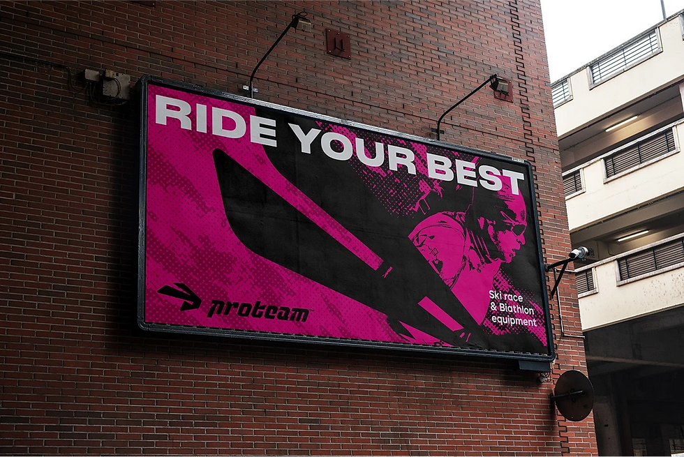
Proteam’s identity extends far beyond the logo. From dynamic ski and biathlon gear designs to apparel, accessories, and powerful advertising visuals, every touchpoint reinforces the brand’s core message: “Ride Your Best.” The packaging design is sleek and minimalistic, focusing on technical precision, while large-format graphics and urban billboards bring the bold personality of Proteam into the public space, creating a strong visual impact.
This branding is not only about aesthetics but also about attitude. Proteam celebrates speed and precision, but it also creates a sense of unity among athletes. Whether it’s professional Olympic champions or ambitious beginners, the brand embodies the same high standard: empowering individuals to push boundaries and win.
With its sharp contrasts, fearless colors, and uncompromising focus on performance, Proteam doesn’t just equip athletes — it fuels their ambition. This is a brand that lives and breathes competition, inspiring everyone who wears it to own the track, own the snow, and own the moment.


