Jazz Festval
- Артемий Рудаков
- Aug 27
- 2 min read
This jazz festival branding uses a bold, energetic, and playful style that reflects the very essence of jazz music — dynamic rhythm, improvisation, and cultural richness.
The logo is constructed with geometric precision but has an artistic twist. The sharp angles and bold typography create a strong visual identity, while the embedded musical symbols (like the saxophone shape) make the logo feel alive and relevant. This is effective because it’s instantly recognizable and conveys both professionalism and creativity, which is essential for a cultural event.
The color palette— dominated by deep red, bright blue, and contrasting neutrals — creates high visual energy. Red conveys passion and excitement, blue adds balance and sophistication, while beige and black give the design an elegant foundation. This combination attracts attention while keeping a clear cultural and artistic vibe, helping the branding appeal to both young audiences and jazz connoisseurs.
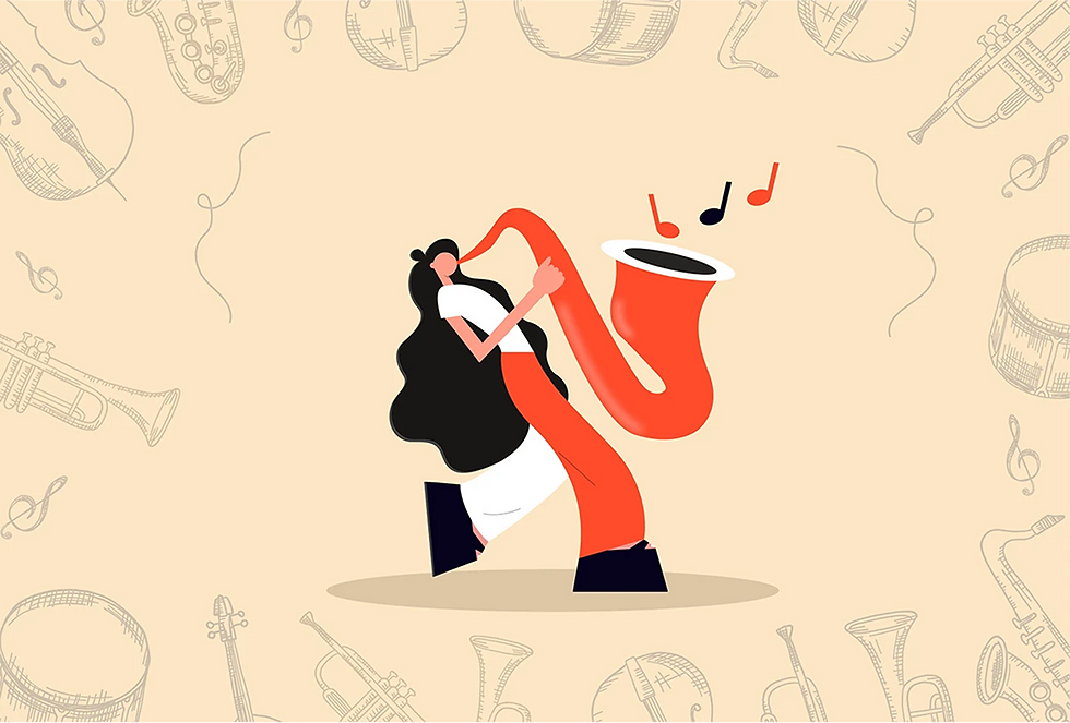
The illustrations are playful and stylized, showcasing musicians and instruments in a simplified, bold form. This style keeps the design modern and approachable, avoiding overly traditional or corporate aesthetics. It also works well across multiple media formats: posters, tickets, badges, and merchandise.
The layout and hierarchy are clear and modular. The use of strong grids and repetition ensures that every element feels connected, while the large typography grabs attention from a distance — perfect for event promotion. The branding also effectively integrates motion elements (like the rhythmic patterning in backgrounds) that reflect the improvisational spirit of jazz, making it visually engaging.
Finally, the application on merchandise—from tickets and badges to coffee cups and T-shirts—demonstrates the versatility of the visual system. Each item feels like part of the same family, reinforcing brand recognition and ensuring that the festival leaves a strong, memorable impression.
Overall, this branding succeeds because it doesn’t just present information; it communicates the festival’s atmosphere. It combines bold visuals, cultural symbolism, and practical structure into a cohesive identity that can excite audiences and make the event instantly recognizable.


