ExoCream
- Lex1s20
- Aug 29
- 1 min read
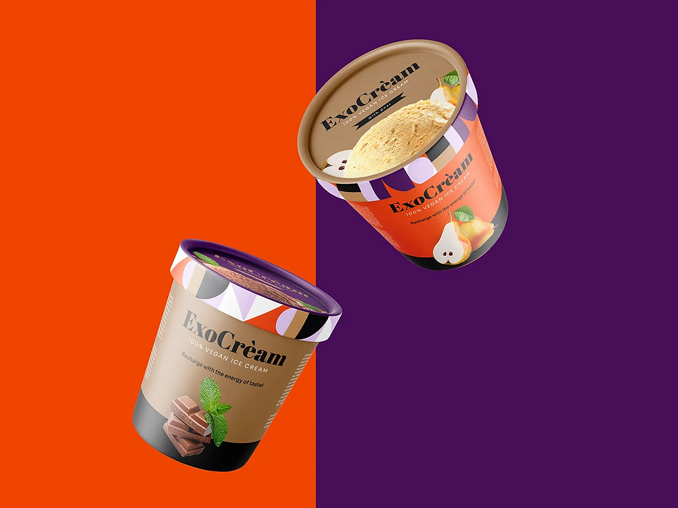
The ExoCrèam brand identity is a bold and playful visual experience that reflects the vibrant character of the product itself. From the very first glance, the combination of bright, contrasting colors—energetic orange, deep purple, and warm neutrals—creates a sense of excitement and indulgence, inviting the viewer to explore the brand.
The geometric patterns incorporated into the packaging design not only add a dynamic, modern flair but also create a recognizable visual language that makes ExoCrèam instantly stand out on the shelf. The typography, with its elegant serif logo paired with clean supporting text, balances sophistication with fun, emphasizing the artisanal quality of the ice cream while keeping it approachable.
High-quality fruit and ingredient illustrations placed prominently on the packaging reinforce freshness and authenticity, while the playful lid details add a premium touch and create a cohesive brand experience. Each flavor has its own distinct color story, allowing for an intuitive and visually engaging product lineup. Altogether, this design transforms ExoCrèam from a simple dessert into a lifestyle product—an expressive, joyful indulgence that visually communicates its promise of bold flavors and refined craftsmanship.