Cloud Sip
- Lex1s20
- Aug 29
- 1 min read
Cloudsip is a brand that turns the simple act of enjoying a drink into an emotional adventure. Its identity is built on energy, lightheartedness, and friendliness, creating an atmosphere where every detail is filled with positivity and playfulness.
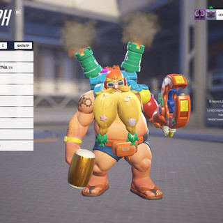
The visual system is based on a vibrant color palette — bold blue, juicy red, sunny orange, and deep chocolate brown form a distinctive and memorable brand language. The cheerful mascot instantly draws a smile, reinforcing the sense of approachability and fun. Typography is soft, rounded, and welcoming, perfectly highlighting the brand’s accessible and contemporary character.
Cloudsip’s branding is as lively in the real world as it is in digital spaces. From packaging that stands out on the shelf to branded cups, merchandise, and promotional materials — every brand touchpoint is designed to deliver a celebratory vibe. The visual identity scales effortlessly, looking just as striking on mobile screens as it does on large outdoor displays.
This is more than just a beverage brand — it’s an invitation to moments of joy and ease. Cloudsip brings people together, turning every sip into part of a cheerful, shared experience where emotions matter just as much as the product.
Cloudsip — your sip of happiness, wrapped in bold, energetic design that can’t be ignored.


