Sole
- Артемий Рудаков
- Aug 27
- 1 min read
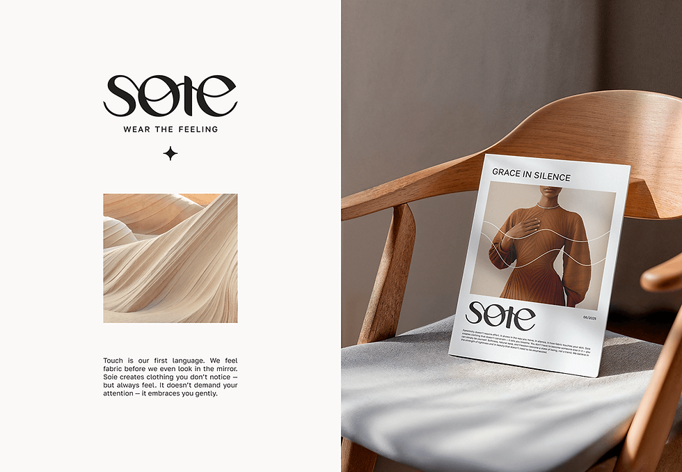
This website for the Sote brand is not just a visual identity but a complete emotional experience. It greets the user with smooth lines and soft textures inspired by the natural forms of sand dunes, instantly immersing them in an atmosphere of tactility and refined aesthetics.
The neutral color palette, built on warm terracotta and beige tones, creates a sense of comfort and natural harmony, while minimalist typography reinforces the impression of premium quality and tranquility. The logo, with its elegant curves, echoes the shapes of fabric and wind, emphasizing the brand’s philosophy: clothing is not just style, it is a feeling you can “wear.” Photography, shot in soft natural light, highlights textures and details, turning the website into a visual gallery where every element is meticulously crafted. Accent elements such as abstract waves and star-like symbols add emotional depth to the brand and create a sense of refined exclusivity.
The entire structure of the website is intuitive and spacious, allowing the content to “breathe” and guiding the user to the essence of the brand without unnecessary visual noise. This project conveys not only Sote’s aesthetic but also its values—naturalness, elegance, and the emotional connection between product and person—transforming the website visit into a full sensory journey.